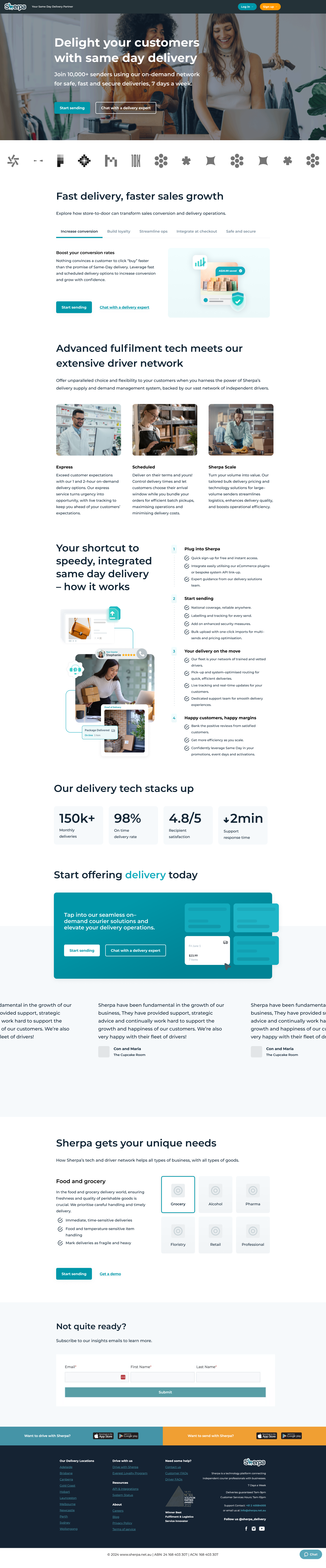
The business landing page on Sherpa’s website lacked clarity, structure, and a user-focused approach. It attempted to serve multiple audiences at once, resulting in overlapping content and a confusing experience for business users. Key information was difficult to find, and there was no clear onboarding path for different types of business customers.
My goal was to redesign this landing page to create a streamlined, intuitive entry point tailored specifically to Sherpa’s business partners.The original website suffered from excessive content packed into a single screen without a clear segregation of different user groups, missing app links, unclear navigation, and a footer overloaded with irrelevant or repeated information. Support resources were not easily accessible, and there was no clear hierarchy for key features that matter most to business users. Most importantly, the onboarding journey was vague and poorly defined. The new design focuses on guiding users with clarity, segmenting content based on user needs, and introducing a clean structure that improves navigation, engagement, and trust from the very first interaction.
Discovery and Research
I began by thoroughly auditing Sherpa’s existing business landing page to identify usability issues and pain points. It became clear that the page tried to address multiple audience types simultaneously, causing overlapping content and a lack of clarity. Users struggled to find key information quickly, navigation was confusing, and the onboarding path for business partners was unclear. Additionally, important support resources were buried or missing, and the footer contained excessive, irrelevant information. These issues led to a disjointed user experience with low engagement and trust.
User Experience (UX) Design
To complement the improved UX, I designed a clean, modern interface aligned with Sherpa’s brand identity. I implemented a consistent colour palette and typography to enhance readability and visual hierarchy. Interactive elements such as buttons and links were designed with clear affordances to encourage clicks and conversions. The footer was redesigned to include only essential information, improving overall page balance and reducing clutter. The result is a business landing page that feels welcoming, professional, and easy to navigate, inspiring confidence from first glance.
User Interface (UI) Design
The UI was crafted to align with Sherpa’s brand voice, clean, modern, and approachable. Typography, colour, and spacing were consistently applied to highlight hierarchy and improve scan-ability. Interactive elements like buttons and carousels were designed for clarity and ease of use across devices. The footer was streamlined to essential links and contacts, reducing clutter. The overall design fosters trust and confidence, encouraging users to engage with Sherpa’s delivery solutions.

Design Process
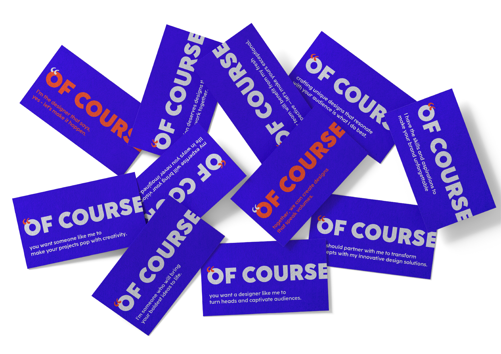
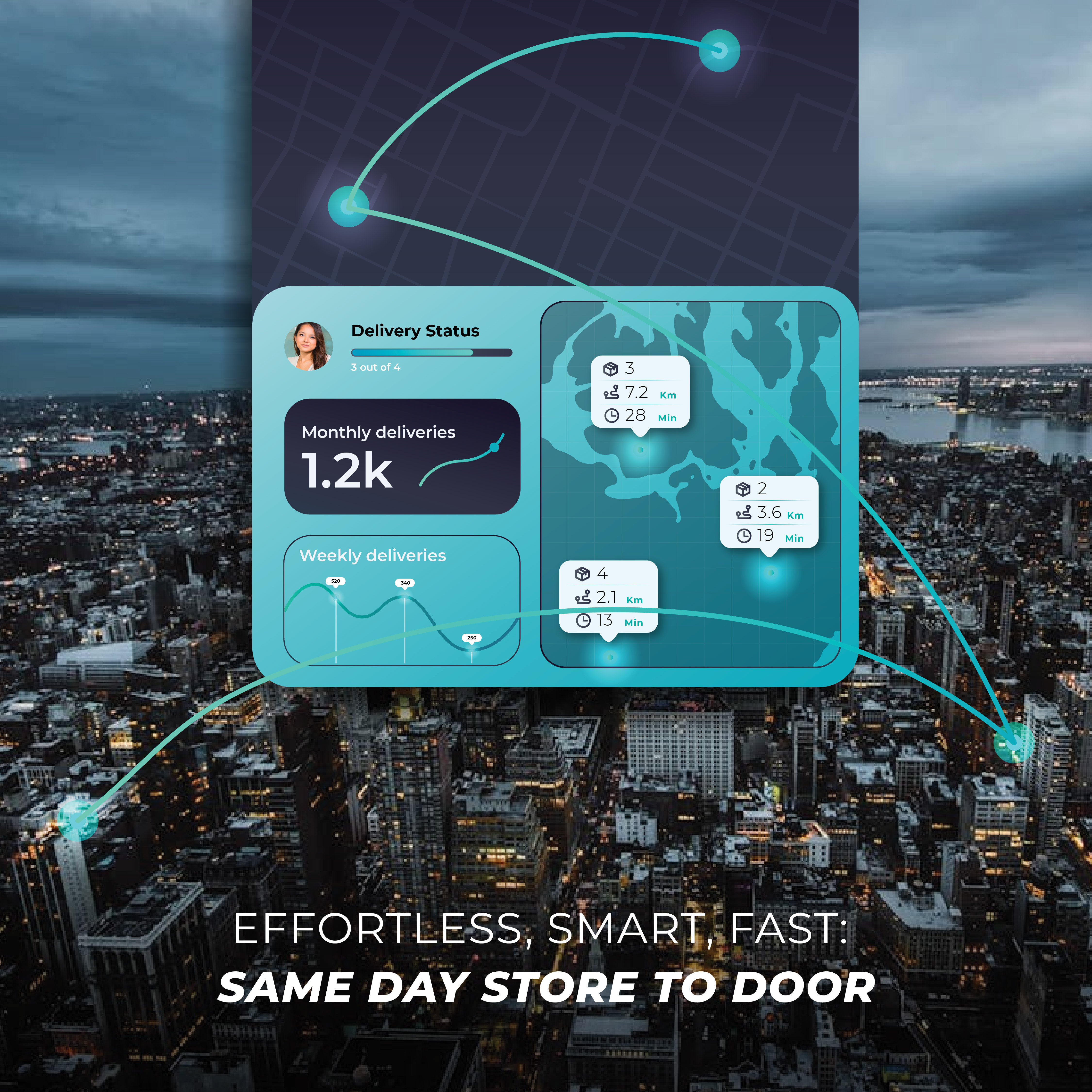
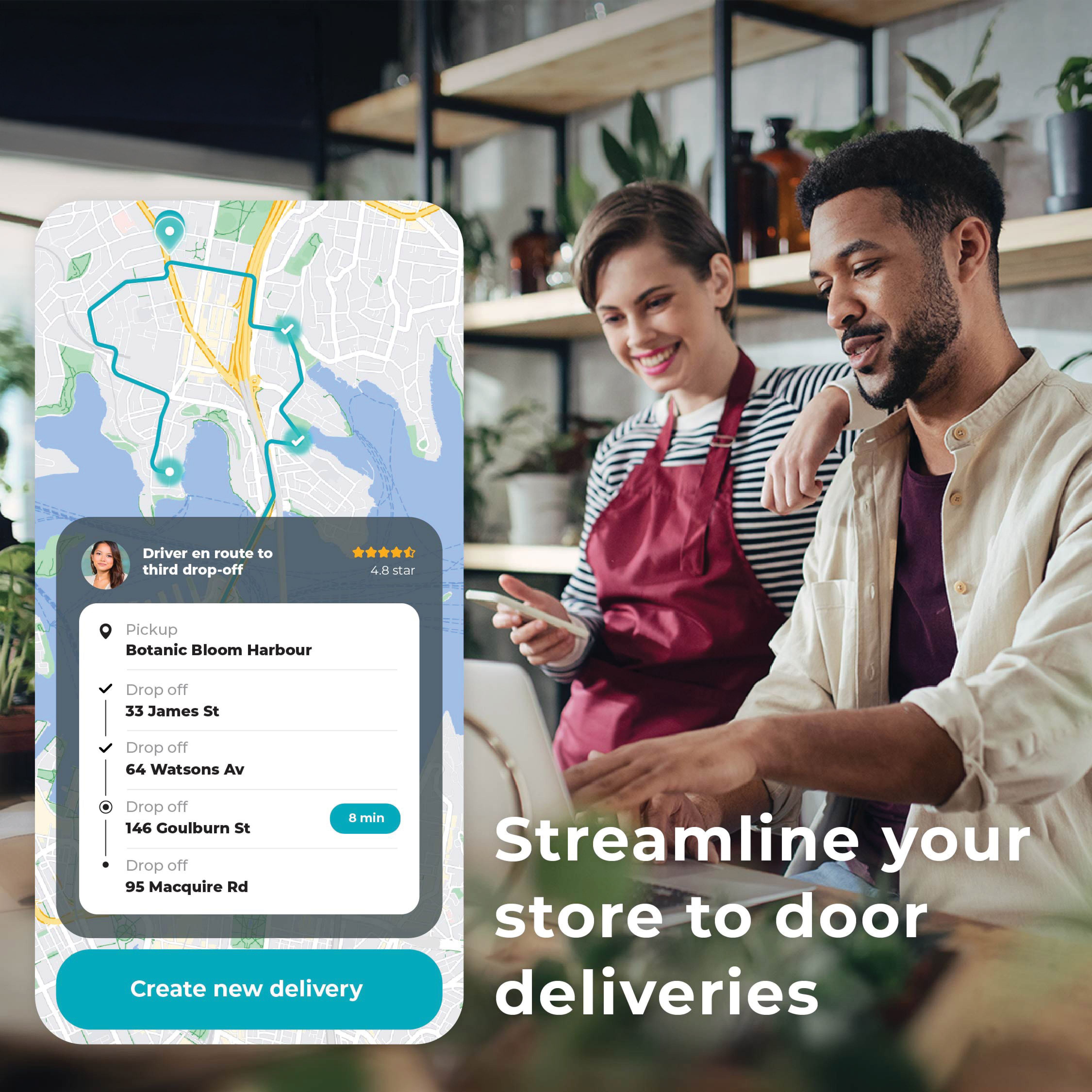
The design process for the Sherpa Business landing page began with a rough content draft provided by the marketing team. I organized the content into a clear structure, segmenting it into key sections such as the header, brand logos, business benefits, product offerings, features and timeline, statistics, testimonials, categories, and final call-to-action elements. Each section was broken down into smaller components to establish a cohesive content hierarchy. Using Figma, I developed wireframes to define layout and flow, collaborated closely with the team to refine messaging and structure, and identified the necessary visual elements; such as icons, illustrations, and product imagery; to bring the story to life. The final design prototypes balanced user clarity with strong brand alignment, transforming the initial draft into a streamlined, high-converting landing experience.
Achievements
By applying UX, UI, and content design principles, I transformed Sherpa’s Business landing page from a cluttered, multi-audience layout into a streamlined, user-focused experience tailored for business partners. The redesigned page features segmented pathways, clear onboarding steps, improved visual hierarchy, and conversion-driven CTAs, demonstrating how thoughtful design and iterative collaboration can simplify complexity, boost clarity, and build trust.
Figma File
Wireframe
I created over 8 versions of wireframes for the new dashboard design, exploring different layout structures and interaction flows. These wireframes helped define the user experience and were later refined into high-fidelity designs that incorporated visual elements, branding, and UI consistency.
UI assets
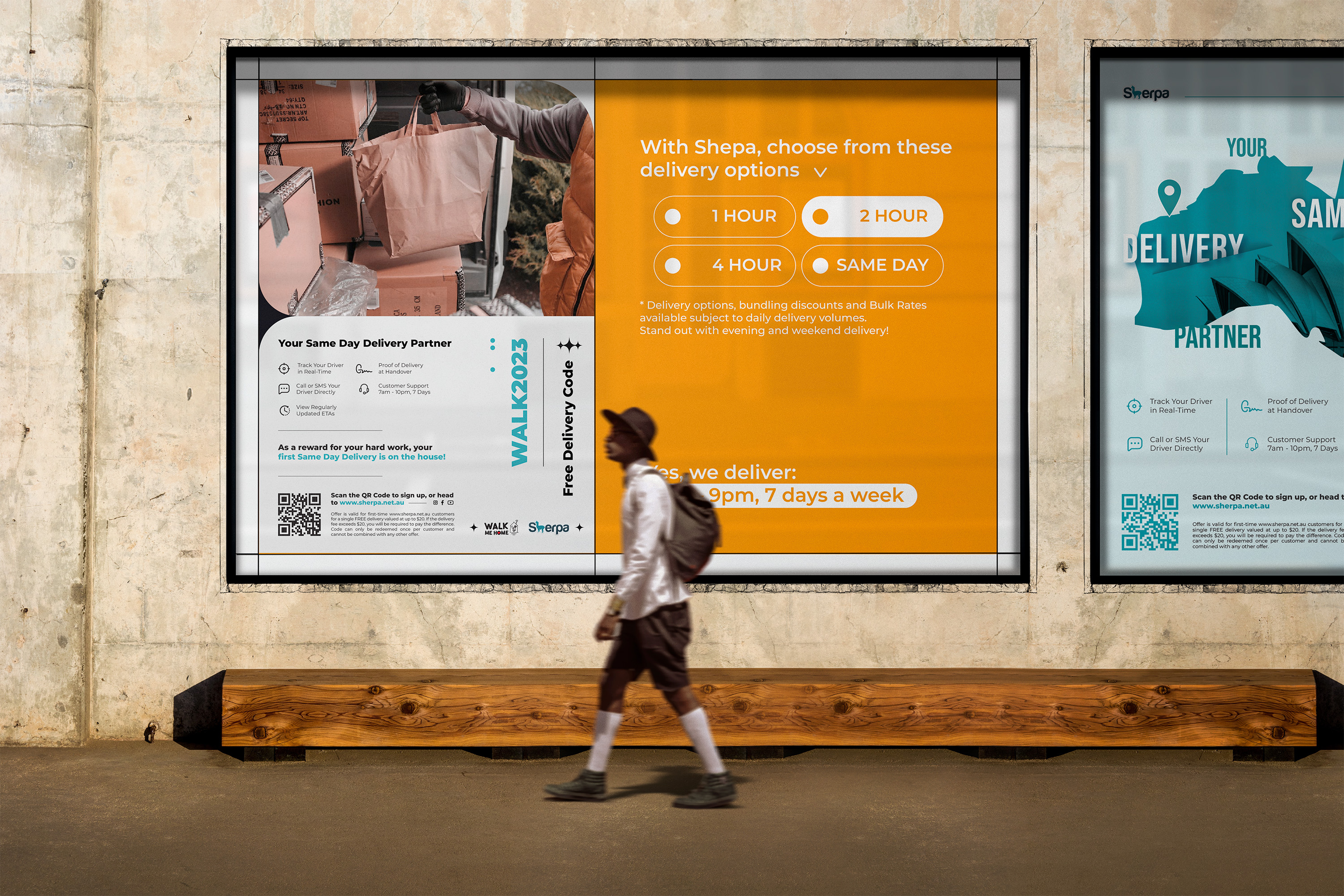
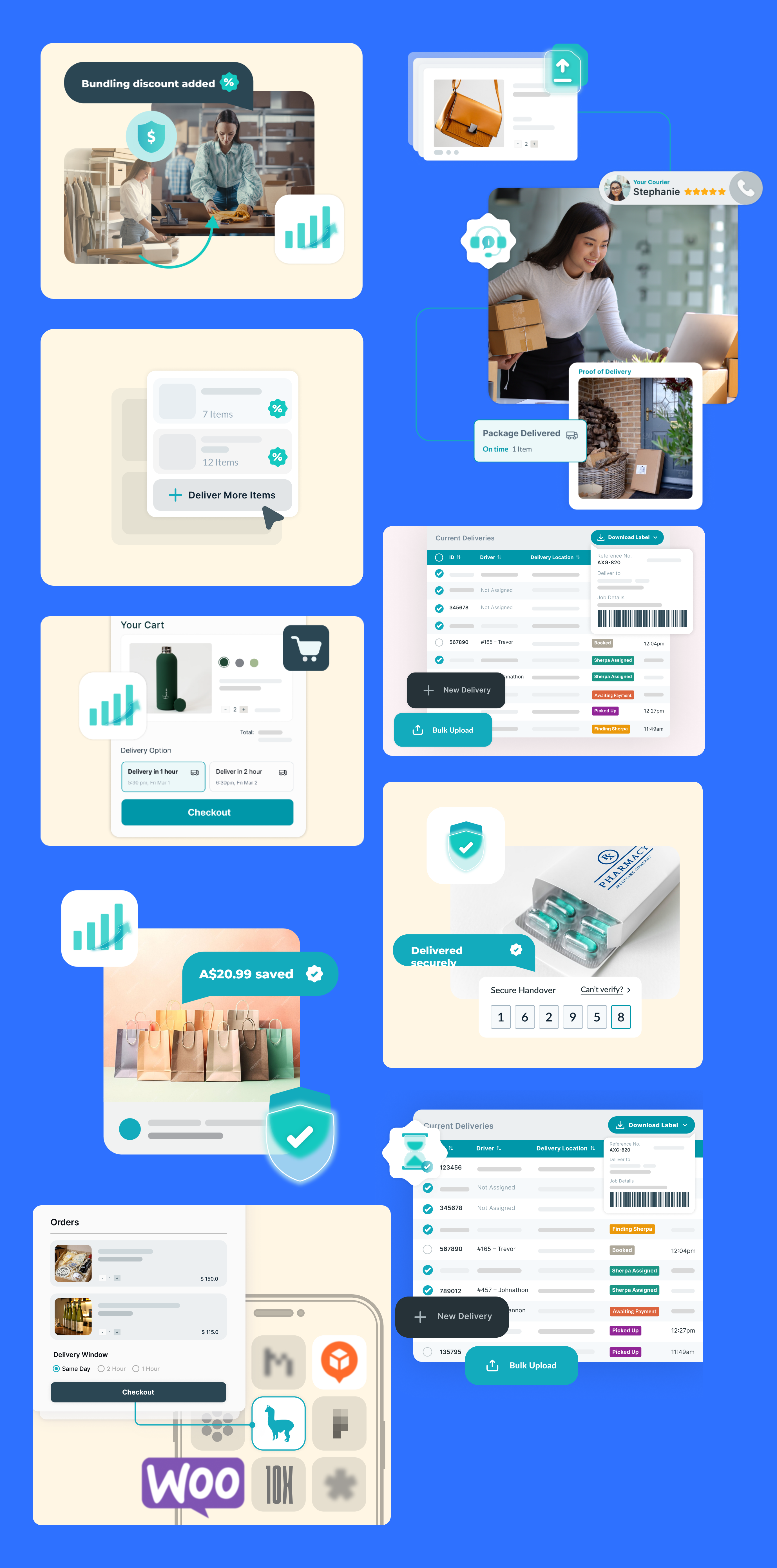
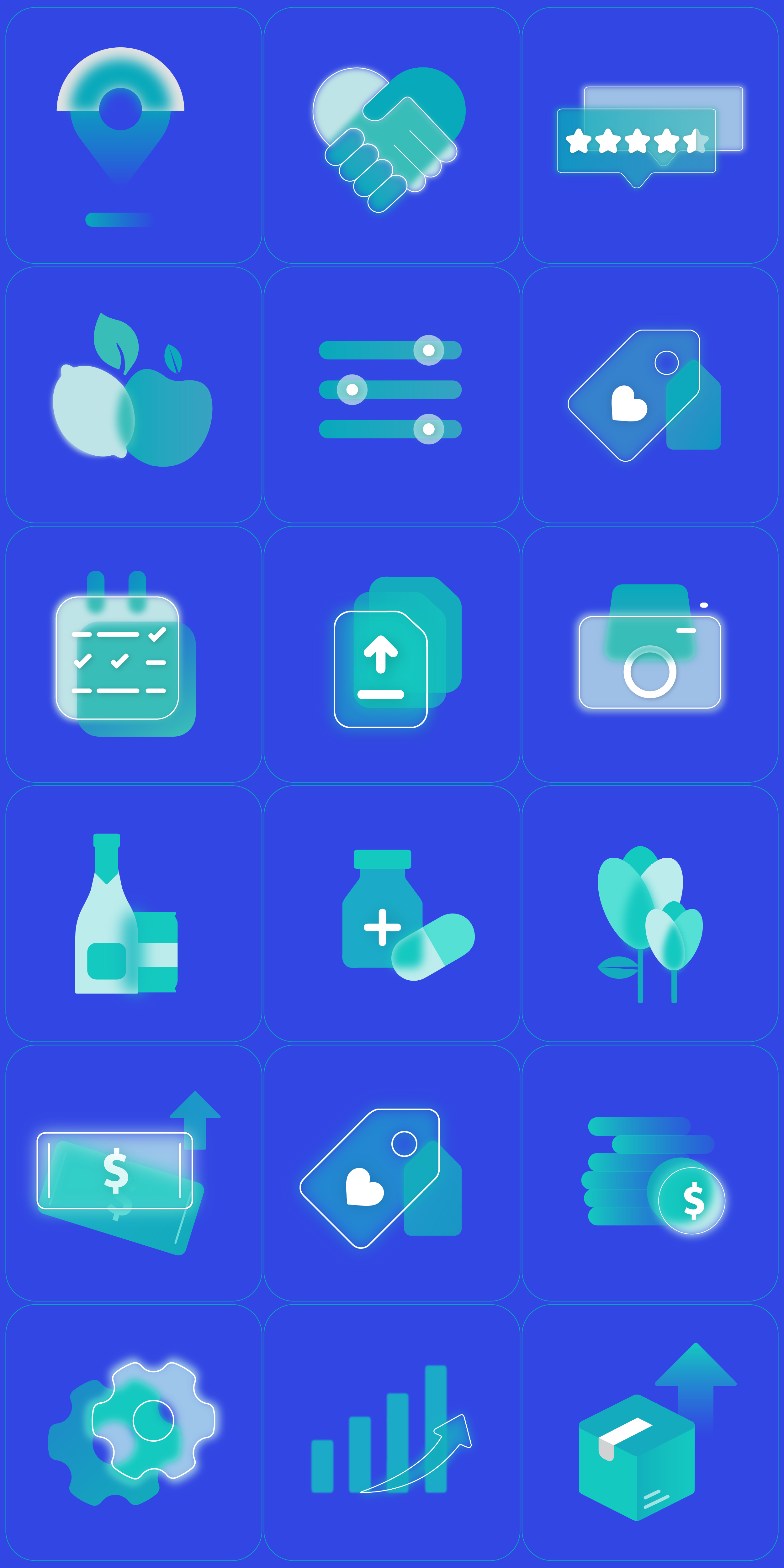
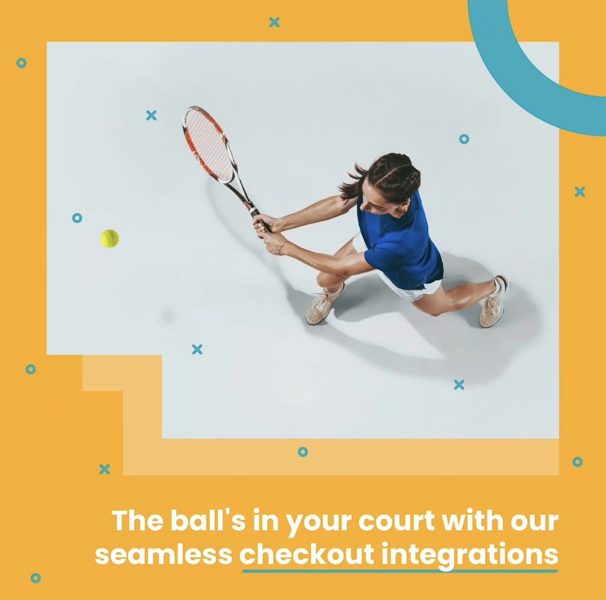
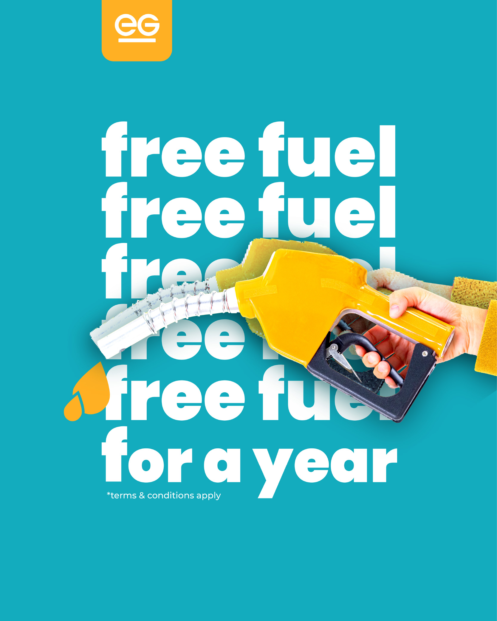
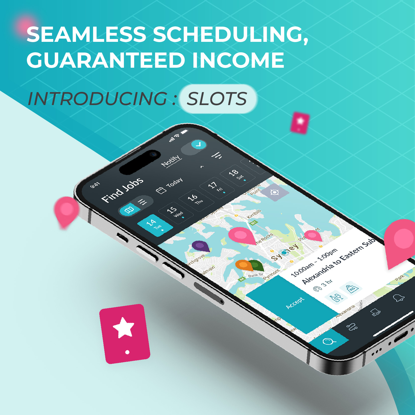
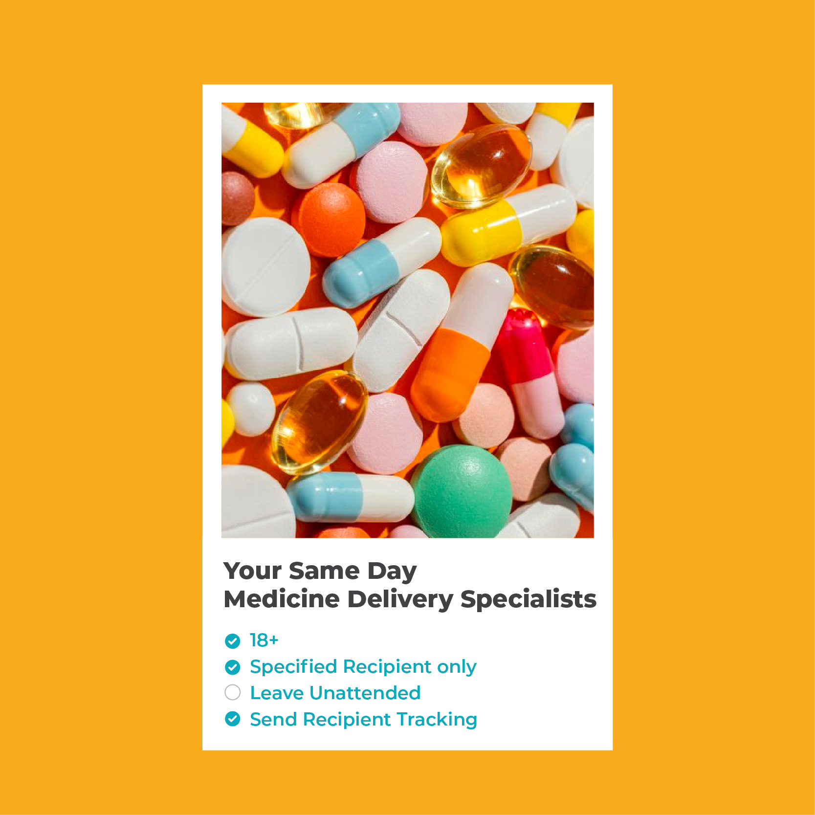
I created a range of UI assets, including imagery, iconography, process diagrams, and infographics, to visually communicate the service flow and category-specific use cases. I also integrated existing app elements to give users a clearer sense of how the experience would function from start to finish, tailored to both their business category and operational scale. These visual components helped simplify complex processes and enhanced overall user understanding.
Design Process
The design process for the Sherpa Business landing page began with a rough content draft provided by the marketing team. I organized the content into a clear structure, segmenting it into key sections such as the header, brand logos, business benefits, product offerings, features and timeline, statistics, testimonials, categories, and final call-to-action elements. Each section was broken down into smaller components to establish a cohesive content hierarchy. Using Figma, I developed wireframes to define layout and flow, collaborated closely with the team to refine messaging and structure, and identified the necessary visual elements; such as icons, illustrations, and product imagery; to bring the story to life. The final design prototypes balanced user clarity with strong brand alignment, transforming the initial draft into a streamlined, high-converting landing experience.
Achievements
By applying UX, UI, and content design principles, I transformed Sherpa’s Business landing page from a cluttered, multi-audience layout into a streamlined, user-focused experience tailored for business partners. The redesigned page features segmented pathways, clear onboarding steps, improved visual hierarchy, and conversion-driven CTAs, demonstrating how thoughtful design and iterative collaboration can simplify complexity, boost clarity, and build trust.
Figma File
Hi-Fi Designs
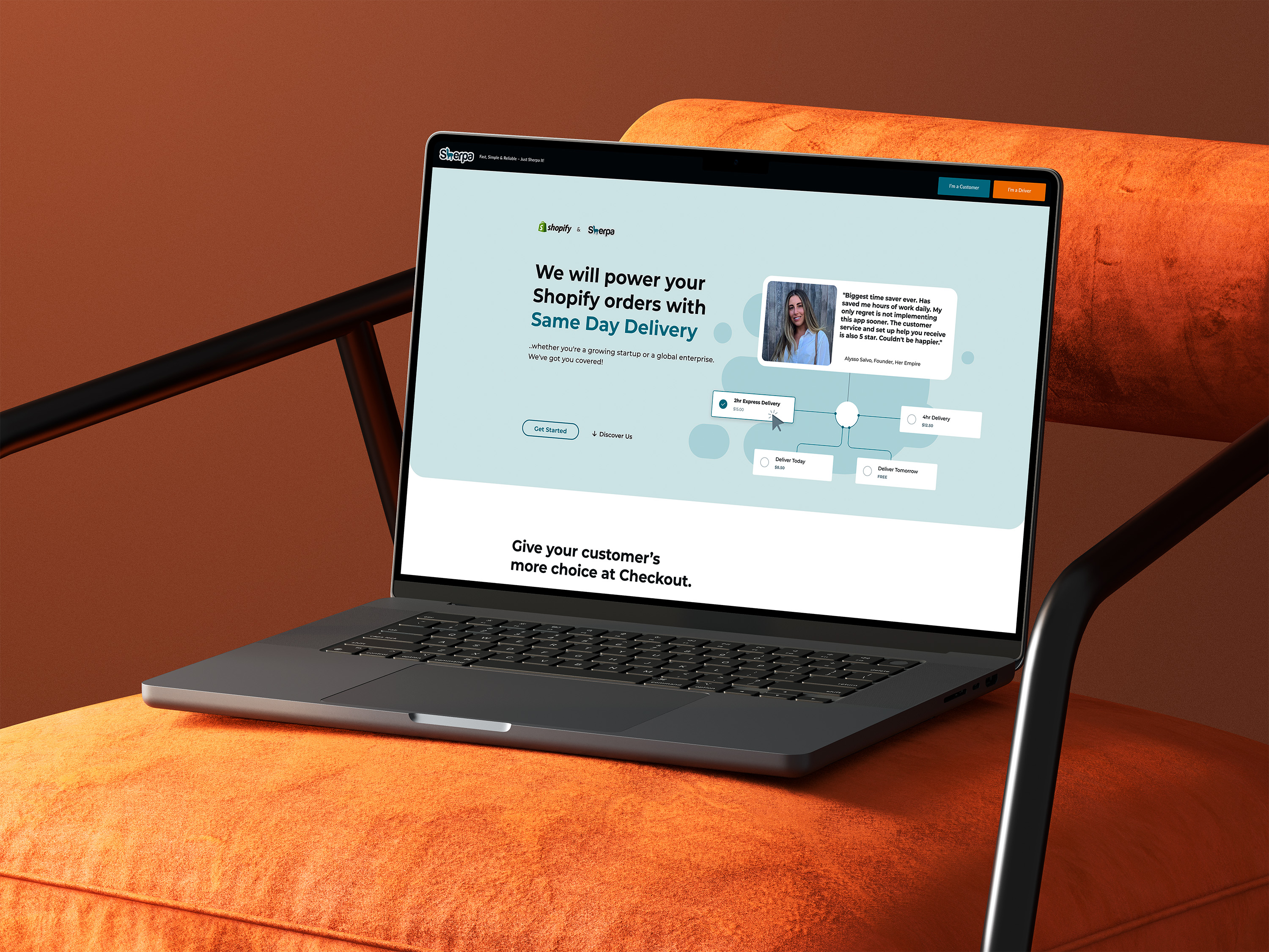
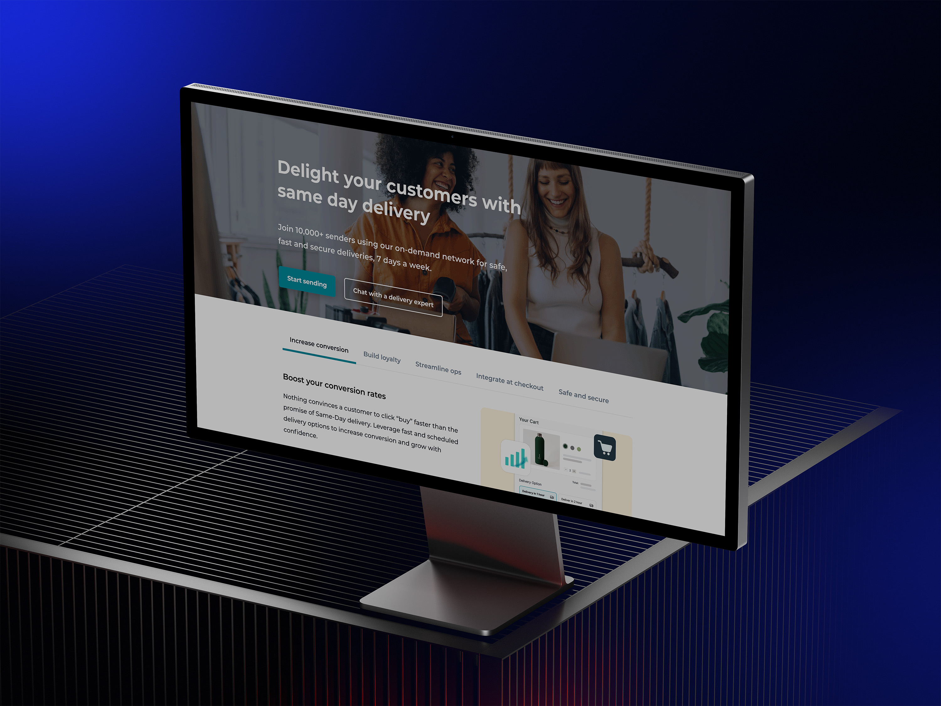
Once the wireframes and section structure were finalized, I developed multiple versions of high-fidelity designs to simulate the user experience and bring the interface to life. These designs were shared with the team to gather initial feedback, which informed several rounds of iteration to enhance usability and clarity. The high-fidelity prototypes also helped communicate functionality and interactions clearly to the developers, streamlining the handoff and ensuring alignment between design and development.
The design process for the Sherpa Business landing page began with a rough content draft provided by the marketing team. I organized the content into a clear structure, segmenting it into key sections such as the header, brand logos, business benefits, product offerings, features and timeline, statistics, testimonials, categories, and final call-to-action elements. Each section was broken down into smaller components to establish a cohesive content hierarchy. Using Figma, I developed wireframes to define layout and flow, collaborated closely with the team to refine messaging and structure, and identified the necessary visual elements; such as icons, illustrations, and product imagery; to bring the story to life. The final design prototypes balanced user clarity with strong brand alignment, transforming the initial draft into a streamlined, high-converting landing experience.
Achievements
By applying UX, UI, and content design principles, I transformed Sherpa’s Business landing page from a cluttered, multi-audience layout into a streamlined, user-focused experience tailored for business partners. The redesigned page features segmented pathways, clear onboarding steps, improved visual hierarchy, and conversion-driven CTAs, demonstrating how thoughtful design and iterative collaboration can simplify complexity, boost clarity, and build trust.


Design Process
By applying UX, UI, and content design principles, I transformed Sherpa’s Business landing page from a cluttered, multi-audience layout into a streamlined, user-focused experience tailored for business partners. The redesigned page features segmented pathways, clear onboarding steps, improved visual hierarchy, and conversion-driven CTAs, demonstrating how thoughtful design and iterative collaboration can simplify complexity, boost clarity, and build trust.
The design process for the Sherpa Business landing page began with a rough content draft provided by the marketing team. I organized the content into a clear structure, segmenting it into key sections such as the header, brand logos, business benefits, product offerings, features and timeline, statistics, testimonials, categories, and final call-to-action elements. Each section was broken down into smaller components to establish a cohesive content hierarchy. Using Figma, I developed wireframes to define layout and flow, collaborated closely with the team to refine messaging and structure, and identified the necessary visual elements; such as icons, illustrations, and product imagery; to bring the story to life. The final design prototypes balanced user clarity with strong brand alignment, transforming the initial draft into a streamlined, high-converting landing experience.
Achievements
By applying UX, UI, and content design principles, I transformed Sherpa’s Business landing page from a cluttered, multi-audience layout into a streamlined, user-focused experience tailored for business partners. The redesigned page features segmented pathways, clear onboarding steps, improved visual hierarchy, and conversion-driven CTAs, demonstrating how thoughtful design and iterative collaboration can simplify complexity, boost clarity, and build trust.
Figma File

.png)
%20.png)
.png)


.jpg)